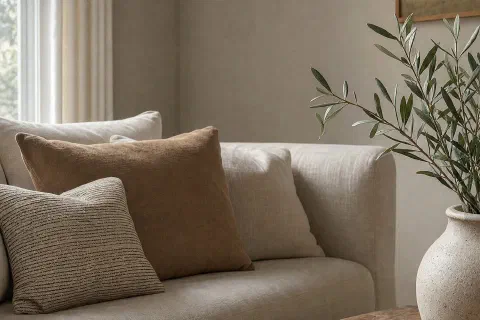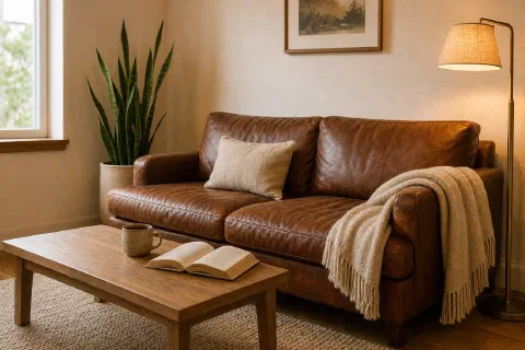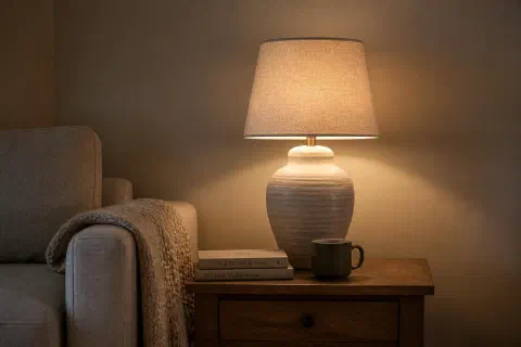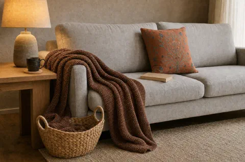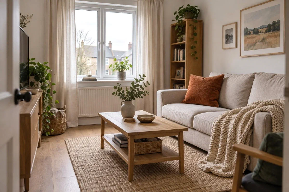
Warm does not have to mean dark, and it does not have to mean yellow.
The reason most warm living rooms read flat is that the palette is built backwards. People pick a wall color first, then try to match furniture and floors to it. The better order is to start with the floor and the largest piece of furniture, pick three values, two materials, and one accent. The walls come last.
These six warm palettes all hold up in real light. Each one comes with paint codes from Sherwin-Williams and Benjamin Moore, the material pairing that makes the palette feel layered, and one accent color that brings it together without overwhelming the room.
What Is the Coziest Color Palette?
Warm neutrals, every time: cream walls, an oat sofa, an oak floor, and one clay accent. That is the most forgiving cozy color palette you can start from, because it survives bad light, a north-facing window, and the furniture you already own. Chasing a trendier set of cozy colors usually costs more up front and dates faster than the neutral version does.
How to Build a Warm Palette
A palette is three values, two materials, one accent.
The three values are a light, a mid, and a dark. The light is usually the wall. The mid is usually the largest piece of furniture. The dark is usually the floor or the rug. The two materials are wood and one textile, usually oak and wool, or walnut and linen. The accent is a single color used in one or two small pieces: a throw pillow, a ceramic vase, a single chair.
If the room has more than three values, more than two materials, or more than one accent, it stops reading warm and starts reading busy.
If you have run into the three-colour rule before, this is the same idea in work clothes. The version most designers quote is 60-30-10: sixty percent of the room in a dominant colour, thirty in a secondary, ten in an accent. In a living room the sixty is the walls and the big rug, the thirty is the sofa and the largest wood pieces, and the ten is the pillows, the ceramics, and a lamp base.
Three colours is a ceiling, not a target. Two plus a wood tone reads calmer than three, and the wood is doing more work than most people give it credit for.
Palette 1: Warm Neutrals
Cream walls, oat sofa, oak floor, with a single soft clay accent.
- Wall paint: Sherwin-Williams Alabaster SW 7008 or Benjamin Moore White Dove OC-17
- Furniture: Oat-toned linen or boucle sofa, oak or white oak coffee table
- Floor: Natural oak with a clear matte finish, or a wool rug in cream and oat
- Accent: One soft clay throw pillow, one terracotta ceramic vase
This is the most forgiving warm palette in the catalog. It works in every light condition, every room size, and almost every house age.
The shortest version of it, if you are starting from an empty room: a warm ivory rug on the floor, a ripple knit throw in beige (opens Amazon in a new tab) over the arm of the sofa, and one rustic ceramic vase (opens Amazon in a new tab) on the coffee table. Choose the rug in person if you can, because ivory often shifts yellow or gray under store lighting. The accent color can be swapped seasonally without repainting the walls.
Palette 2: Brown and Cream
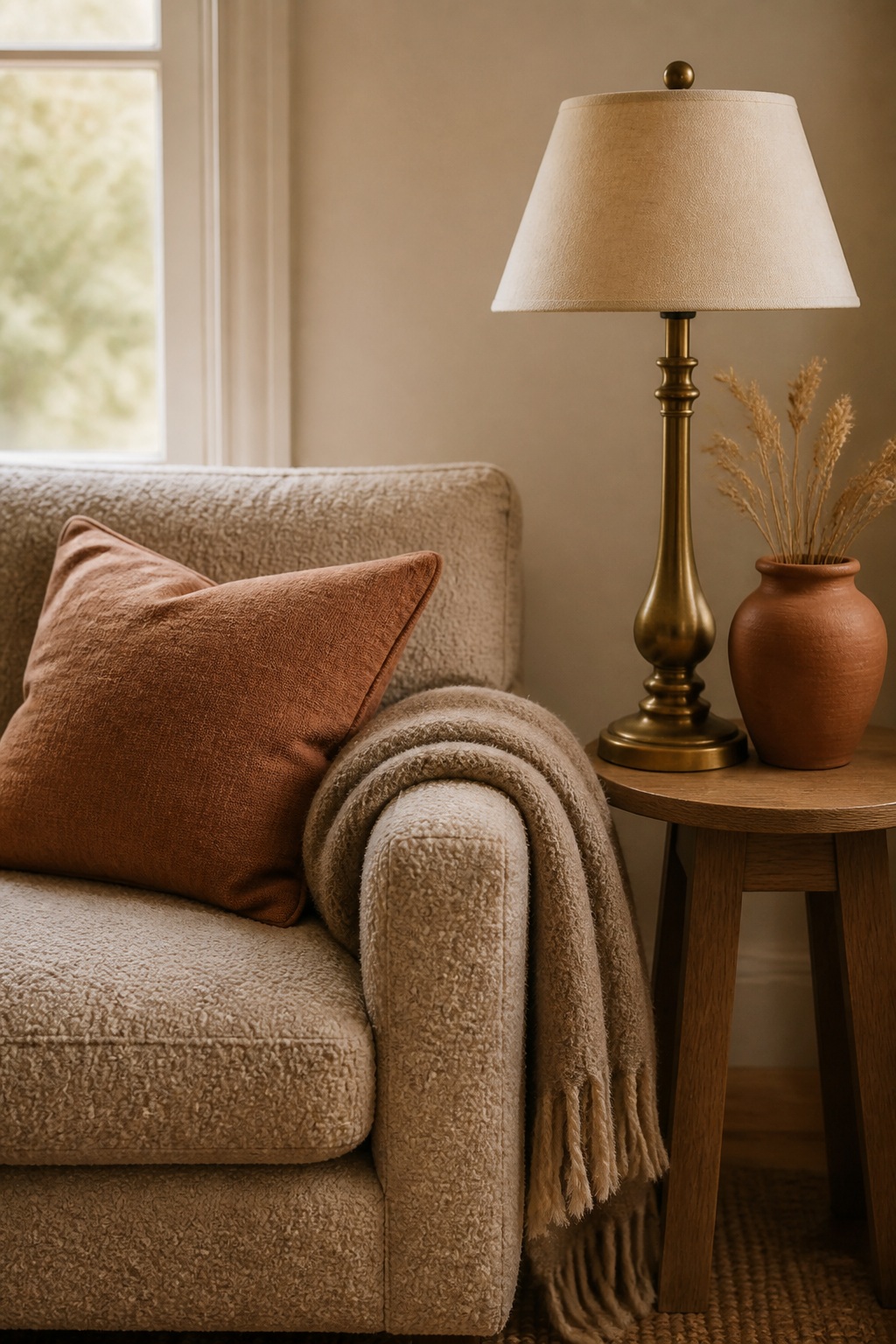
Cream walls, walnut-stained wood, brown leather, with a single brass accent.
- Wall paint: Benjamin Moore Swiss Coffee OC-45 or Sherwin-Williams Creamy SW 7012
- Furniture: A brown leather sofa (warm cognac, not chocolate) or a cream linen sofa with a brown leather chair
- Floor: Walnut hardwood, or a wool rug in cream and walnut
- Accent: Brass lamp base, brass picture frame, brass candleholders
The brown and cream palette reads the warmest of all six. The trick is the cream walls, without them, the brown becomes heavy. The cream gives the brown room to breathe. The brass accent picks up the warm tones in the leather and reflects warm light.
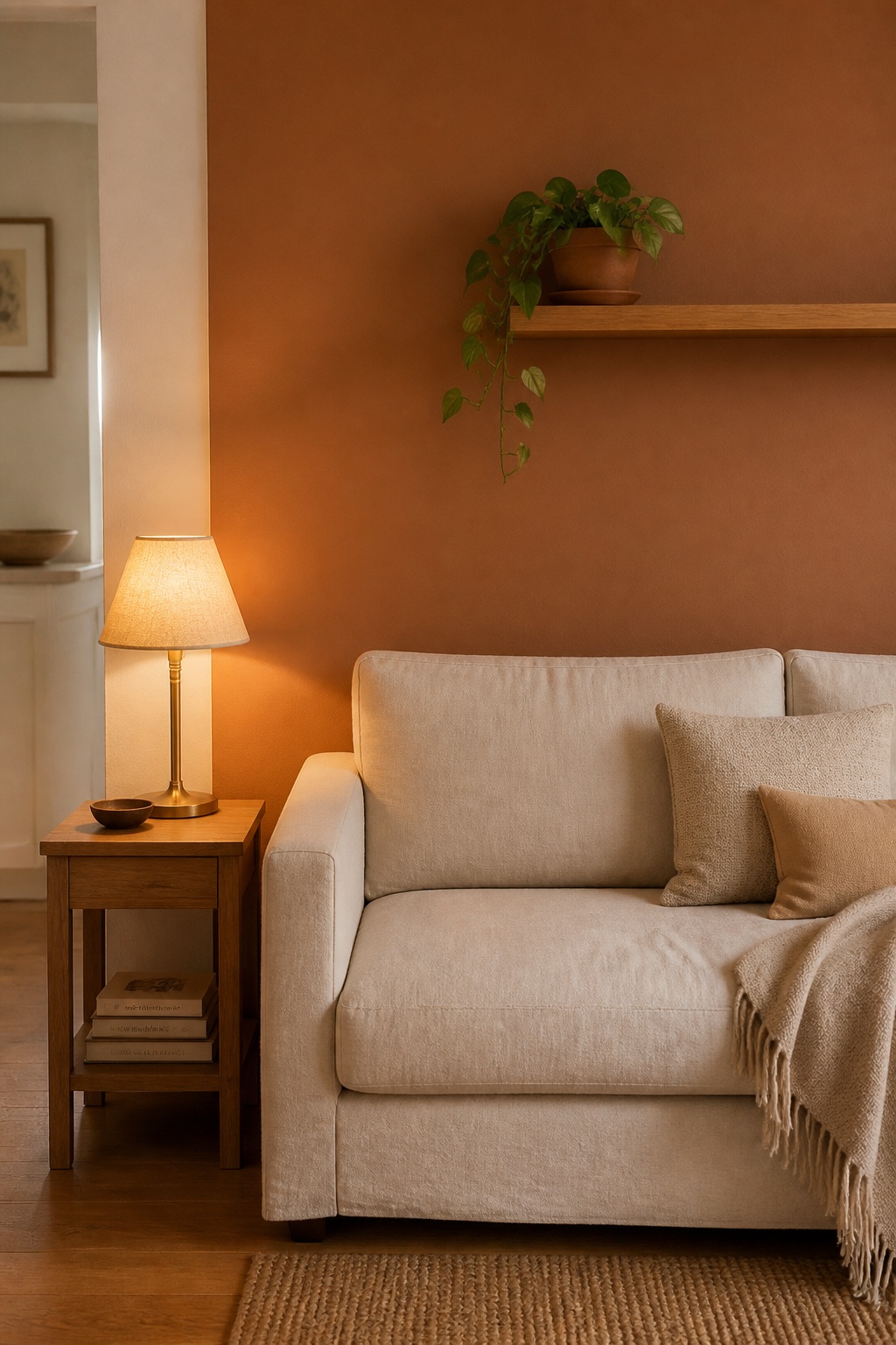
Palette 3: Terracotta and Oak
Warm white walls, oak furniture, terracotta accent wall or sofa, with a single sage accent.
- Wall paint (main): Sherwin-Williams Cotton SW 7104 or Benjamin Moore Simply White OC-117
- Wall paint (accent): Sherwin-Williams Cavern Clay SW 7701 or Benjamin Moore Audubon Russet HC-51
- Furniture: Oak coffee table, oak side tables, cream or natural linen sofa. Or skip the accent wall and go with a terracotta linen sofa instead.
- Accent: A single sage green throw blanket or a sage green ceramic vase
Terracotta is the most assertive of the six warm palettes. It works best when it shows up in one large place, either as an accent wall or as the sofa, and is paired with a quiet sage to keep it grounded.
If repainting a wall is not on the table, the cheapest way to test terracotta in your own light is a pair of burnt orange chenille pillow covers (opens Amazon in a new tab) on a cream sofa. Live with them a week. If the color still looks right at night under lamp light, the accent wall will work too.
Palette 4: Sage and Bone
Bone walls, sage upholstery, oak floor, with a single warm brass accent.
- Wall paint: Benjamin Moore Bone White 968 or Sherwin-Williams Natural Choice SW 7011
- Furniture: A sage green linen or velvet sofa, oak coffee table, cream armchair
- Floor: Oak with a natural finish, or a wool rug in bone and sage
- Accent: Brass floor lamp, brass picture frame, a small brass tray
Sage is the most flexible green for warm palettes. Unlike emerald or forest, it reads as a warm color when paired with bone and oak. The brass accent pulls everything together without competing with the sage.
Palette 5: Dusty Rose and Walnut
Warm white walls, walnut wood, dusty rose accent, with a cream textile base.
- Wall paint: Benjamin Moore Cloud White OC-130 or Sherwin-Williams Modest White SW 6084
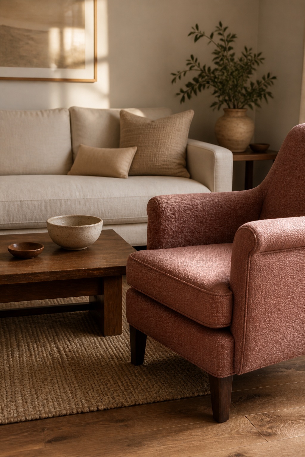
- Furniture: Cream linen sofa, walnut coffee table, dusty rose armchair or chaise
- Floor: Walnut hardwood, or a wool rug in cream and walnut
- Accent: A walnut bowl, a single dusty rose ceramic vase
The dusty rose palette is the most underrated of the six. It reads warm without being childish, and the walnut keeps it grounded. This palette works particularly well in north-facing rooms that struggle with cool light.
The cream textile base is doing more work here than the rose is. A chunky knit throw you can feel in person and a pair of cream linen curtains (opens Amazon in a new tab) are what keep the walnut from reading heavy.
Palette 6: Deep Ochre and Linen
Warm linen walls, ochre accent, oak floor, with a single charcoal accent for grounding.
- Wall paint: Benjamin Moore Manchester Tan HC-81 or Sherwin-Williams Accessible Beige SW 7036
- Furniture: Cream linen sofa with deep ochre throw pillows, or an ochre velvet armchair, oak coffee table
- Floor: Oak with a warm stain, or a wool rug in linen and ochre
- Accent: A single charcoal throw blanket, a charcoal ceramic pot, a small charcoal frame
The deep ochre palette is for rooms that get a lot of natural light. In darker rooms it can read mustard. The charcoal accent is what keeps the ochre from feeling too warm. Without the charcoal, the palette gets one-note.
Ochre is hard to buy off a screen because it photographs yellow and arrives mustard. Rust velvet covers (opens Amazon in a new tab) are the safer neighbour of the two and sit closer to what most people picture when they say ochre.
The Six Palettes Side by Side
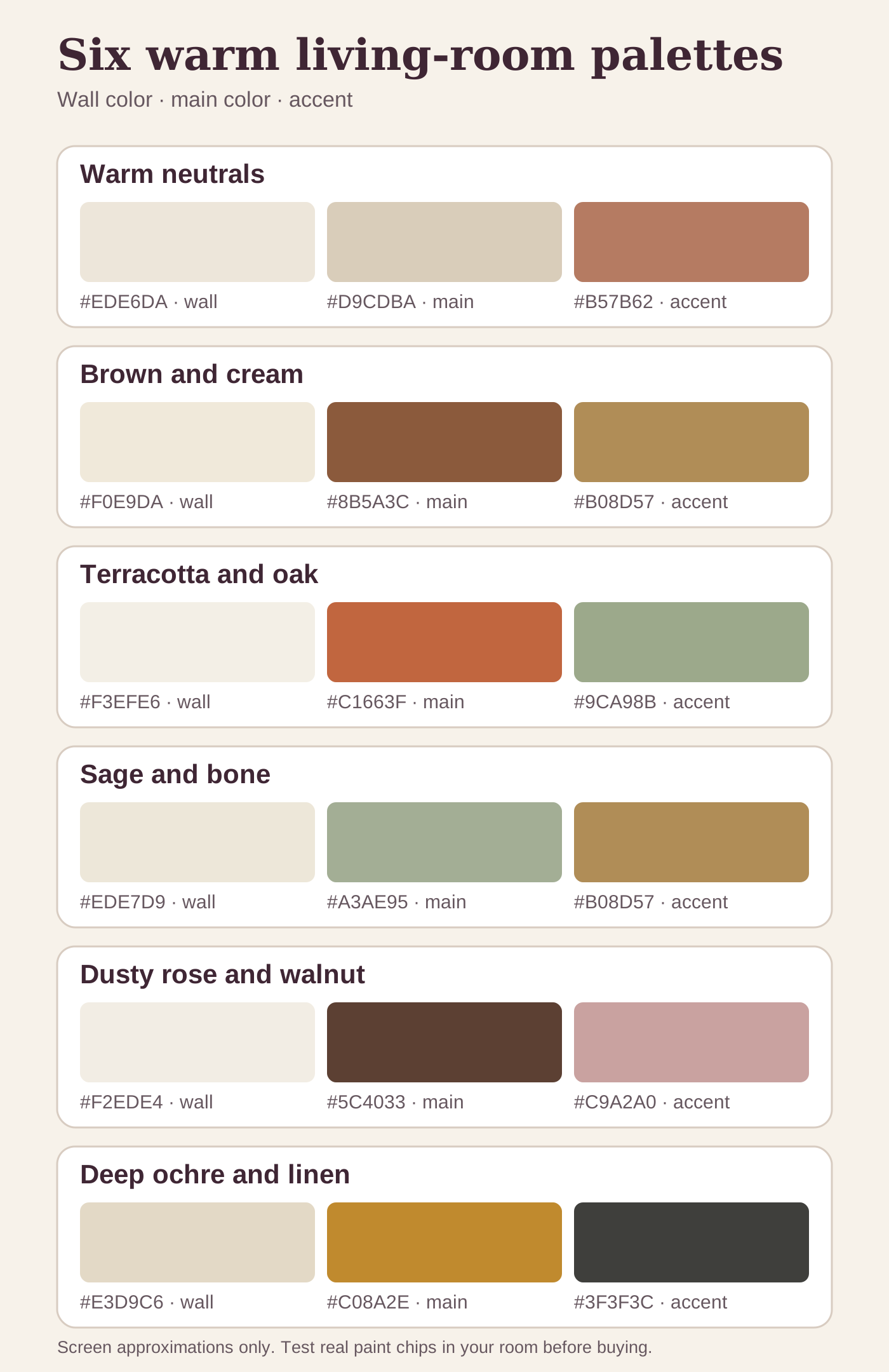
Hex values below are screen approximations of each palette, not paint matches. Use them to check that the three values sit far enough apart, then order real chips from Sherwin-Williams or Benjamin Moore before you buy a gallon. Paint reads differently on a wall than it does on a monitor. Every time.
| Palette | Wall, the light value | The colour that carries it | Accent | Best light | Pairs with |
|---|---|---|---|---|---|
| Warm neutrals | #EDE6DA Alabaster SW 7008, White Dove OC-17 | #D9CDBA oat linen or boucle | #B57B62 soft clay | Any direction, best rescue for north | White oak, wool, rattan |
| Brown and cream | #F0E9DA Swiss Coffee OC-45, Creamy SW 7012 | #8B5A3C cognac leather | #B08D57 brass | East and west, handles the swing | Walnut, leather, brass |
| Terracotta and oak | #F3EFE6 Simply White OC-117 | #C1663F terracotta, Cavern Clay SW 7701 | #9CA98B sage | South, wants strong daylight | Oak, natural linen, unglazed clay |
| Sage and bone | #EDE7D9 Bone White 968, Natural Choice SW 7011 | #A3AE95 sage upholstery | #B08D57 brass | East, balances morning and afternoon | Oak, velvet or linen, brass |
| Dusty rose and walnut | #F2EDE4 Cloud White OC-130 | #5C4033 walnut wood | #C9A2A0 dusty rose | North, the best fix for cool light | Walnut, cream linen, stoneware |
| Deep ochre and linen | #E3D9C6 Manchester Tan HC-81, Accessible Beige SW 7036 | #C08A2E deep ochre | #3F3F3C charcoal | South only, goes mustard in a dark room | Warm-stained oak, velvet, charcoal ceramic |
Read the table down the accent column and the pattern the whole page runs on shows up. Every palette has exactly one loud thing in it, and the two columns beside it are there to keep that one thing quiet.
The Best Warm Color for a Living Room
There is no single answer, and anyone who hands you one has not seen your floor. There is a reliable default though: a warm white on the walls, with the warmth coming from the furniture and the textiles instead. Alabaster SW 7008 and White Dove OC-17 are the two most-used versions of that for a reason. They stay soft in daylight and go golden under a lamp rather than going grey.
If you want the wall itself to carry the warmth, the run that works most often is warm greige, then clay, then terracotta, then ochre. Accessible Beige SW 7036 and Revere Pewter HC-172 sit at the safe end of it. Cavern Clay SW 7701 sits at the loud end. Every step along that run needs more natural light than the one before it.
What actually makes a living room feel warmer is rarely the paint on its own. Roughly in order of effect for the effort:
- Check the bulbs before repainting. The U.S. Department of Energy’s color-temperature table describes 2700K as warm and 4100K as cool. If a room looks blue-grey after sunset, test a 2700K lamp before judging the wall color. The full 2700K guide covers lumens and placement too.
- Put down a wool or jute rug. Texture registers as warmth before colour does.
- Add a second light source at eye level or lower. One ceiling fixture flattens a room. A table lamp plus a floor lamp warms it.
- Bring in one wood tone with visible grain. Oak, walnut, or rattan. Painted furniture does not do this job.
- Swap cool grey and stark white textiles for cream, oat, or clay. Curtains and pillows first, since they cover the most area for the least money.
- Then paint. Paint comes last because everything above it is faster, cheaper, and easier to undo.
How to Test a Palette Before Committing
Buy small paint samples for the wall colors and test them in the actual room before painting. Paint a two-foot square on the wall that will get the most light, and another two-foot square on the wall that will get the least light. Live with it for three full days, including evening light with the lamps on.
The same goes for fabric. Order swatches of the sofa or chair fabric and hold them up against the wall sample in different lights. A warm white can read pink in morning light and yellow in evening light. A sage green can read grey in cool light and gold in warm light. The room reveals the palette, not the paint chip.
What Not to Do
A few warm-palette mistakes worth naming:
- Don’t use more than one accent color. Two accent colors compete. One accent color anchors the room. If a second color shows up, it has to be in just one small place: a single throw pillow, a single ceramic, a single picture frame.
- Don’t pair a warm wall with a cool floor. Cool grey floors fight every warm palette on this list. If the floor is cool, either replace it or cover it with a warm wool rug that takes up most of the room.
- Don’t paint the ceiling white if the walls are cream. The white ceiling will read blue against the cream and flatten the warmth. Paint the ceiling the same color as the walls, or one shade lighter, but in the same warm family.
- Don’t skip the textile. A warm palette without a wool throw, a linen sofa, or a wool rug feels staged. The texture is what makes the warmth read as cozy and not just colored.
How the Palette Lives With the Light
The same palette behaves differently depending on the direction the room faces.
- South-facing rooms get the most natural light and the warmest light. All six palettes work, but the terracotta and the deep ochre will read most assertive.
- North-facing rooms get the least warmth from natural light. The dusty rose and the warm neutrals are the most flattering. Skip the deep ochre, it will read flat.
- East-facing rooms get warm morning light and cool afternoon light. The sage and bone palette balances both. The brown and cream also handles the swing.
- West-facing rooms get cool morning light and warm afternoon light. The brown and cream and the terracotta palettes both come alive in the late afternoon.
Warm Tones, Warm Colours, Warm Neutrals: What People Actually Mean
The vocabulary around this is loose, and the words get used interchangeably in ways that make shopping harder than it needs to be.
- Warm colours are anything on the red, orange, and yellow side of the wheel. Terracotta, ochre, rust, clay, and warm brown all qualify.
- Warm neutrals are the near-whites and beiges that carry a hint of yellow or red underneath. Cream, oat, bone, greige leaning warm.
- Warm tones usually describes the undertone rather than the colour itself. A sage green can be a warm tone if there is yellow underneath it. A grey can be a warm tone if there is brown underneath it.
- A warm colour scheme is the whole set working together: wall, large furniture, floor, and one accent.
The practical takeaway is that a room reads warm because of undertone, not because of how dark or saturated the paint is. A pale room can be warm. A deep room can be cold.
Warm and Cool Undertones, and How to Tell Them Apart
An undertone is the colour hiding underneath the colour. It only shows itself next to something else, which is exactly why a chip looks right in the store and wrong on the wall.
The test takes ten seconds. Hold the paint chip flat against a sheet of plain printer paper, which is close to a true cool white. A warm undertone will flash yellow, peach, or faintly pink against it. A cool undertone will flash blue, grey, or lilac. If the chip suddenly looks dingy, it is warm, and the paper is what is making it look that way.
Grey is where this matters most, because grey is where people get burned. Revere Pewter HC-172, Edgecomb Gray HC-173, and Agreeable Gray SW 7029 all carry brown or green-brown underneath and behave like warm neutrals. A true cool grey sitting next to terracotta or cognac leather makes both of them look muddy.
The same paper test works on wood and fabric. Hold the flooring sample or the upholstery swatch against it. Red oak flashes pink, white oak flashes yellow-grey, walnut flashes purple-brown. Once you know which way a material leans, you stop fighting it.
Warm Colors for a Living Room, Picked by What the Room Already Has
Most advice on warm colors for a living room starts with the color. Start with the floor instead, because it is the one thing you are least likely to change.
- Red oak or honey oak floors. Already warm and already yellow. Do not add a second yellow. Warm neutrals or sage and bone. Skip the deep ochre.
- Walnut or dark stained floors. Brown and cream, or dusty rose and walnut. The cream walls are what stop the room going cave-like.
- Grey or cool toned LVP. The hardest starting point. Cover most of it with a large natural-and-ivory rug you have seen in your own light, then treat the rug as the floor and pick from there.
- Cream or beige tile. Terracotta and oak. The tile reads as the light value in the palette and the terracotta gets to be the loud one.
- Nothing you like, rented, cannot change. Warm neutrals, and put the money into a rug and one lamp rather than the walls.
The other half of it is the light bulb, which people almost never count as a color decision. A higher color temperature appears cooler and bluer; a lower one appears warmer and more yellow. For these palettes, 2700K is the sensible first sample for evening light, not a guarantee that every paint chip will look right.
Getting the palette on the walls is the expensive half. The pieces that carry it, linen, one lamp, a basket, a green thing in the corner, are mostly cheap: ten Amazon finds under fifty dollars cover almost all of them.
Warm Sofas and Warm Wood Tones
A warm-toned couch moves a room faster than anything else you can do without touching the walls, and it is also the easiest thing to get wrong online, because sofa photography is lit to sell.
The colours that reliably read warm in a living room, light to dark: oat, camel, caramel, cognac, rust, warm brown. Cream counts too, as long as it has yellow underneath it rather than blue. What does not read warm, whatever the listing calls it: true grey, taupe with a purple undertone, and the very pale beige that photographs cream and arrives pink.
Fabric shifts the temperature as much as the colour does. Linen and boucle scatter light and stay soft. Velvet deepens whatever it is dyed, so a rust velvet lands a full step darker in person than a rust linen. Leather warms as it ages and is the only one of the three that looks better worn than new.
Order swatches. Any sofa company worth buying from will send them, and holding a real swatch against your own wall at eight in the evening settles the question the photos never will.
Warm Oak, Red Oak, White Oak, Walnut
Wood tone is the other half of a warm palette and it gets less thought than it earns.
- Red oak is pink-orange and already warm. Most pre-2000 American houses have it. Do not add a second orange beside it. Cream and sage are its best neighbours.
- White oak is what people mean now when they say warm oak. Yellow-grey, calmer than red oak, and it takes a natural or light warm stain without turning orange.
- Honey or golden oak is red oak with a yellow stain over the top. The warmest of the lot, and the one most likely to fight a terracotta or ochre palette.
- Walnut is dark and purple-brown. The only wood here that reads warm and formal at once, which is why it carries the dusty rose palette.
- Rattan and cane count as a wood tone for palette purposes. They add warmth without adding weight, which is worth a lot in a small room.
Two wood tones in one room is fine. Three starts to look accidental unless one is clearly the floor and the other two share an undertone. If you are mixing, repeat each tone at least twice so it reads as a decision rather than a leftover.
The Same Palettes Beyond the Living Room
These six combinations are written around a living room because that is the hardest room to get right, but the logic transfers.
- Bedroom: drop the saturation by one step. The dusty rose and warm neutral palettes both work as-is. A deep ochre bedroom reads heavy under lamp light.
- Sitting room or lounge: treat it exactly like the living room. Smaller rooms benefit from putting the accent on the textile rather than the wall.
- Dining room: this is one place where a deeper palette works especially well. Terracotta and oak or deep ochre and linen both look better under evening light and candles than they do at noon.
- Home office: warm neutrals only. Saturated warm walls compete with screens and get tiring across a workday.
- Whole-home scheme: pick one warm white and carry it through every hallway and transition space, then let individual rooms take their own accent. That single shared white is what makes a house read intentional instead of patchy.
If you are after calm rather than warmth specifically, the softer end of this overlaps with paint colors that make a room feel peaceful .
What I’d Actually Buy
Six palettes is a lot of choice, so here is the short list that works across most of them. Ratings and review counts were checked on 2026-08-15.
- Bourina ripple knit throw, beige (opens Amazon in a new tab) (4.5 stars, 38,100 reviews). The texture item every one of these palettes needs. A warm palette without a textile reads staged.
- Miulee chenille covers, burnt orange (opens Amazon in a new tab) (4.6 stars, 6,400 reviews). The cheapest way to test terracotta or clay before committing a wall to it.
- Miulee velvet covers, rust (opens Amazon in a new tab) (4.6 stars, 69,500 reviews). Deeper and less orange than the chenille. This is the ochre stand-in.
- Vanselia rustic ceramic vase (opens Amazon in a new tab) (4.6 stars, 1,195 reviews) and the Mitt&Ditt 11 inch vase with handles (opens Amazon in a new tab) (4.8 stars, 943 reviews). One accent ceramic per room, not three.
- Cream linen back tab curtains, 84 inch (opens Amazon in a new tab) (4.6 stars, 6,800 reviews) or the Owenie cream sheers (opens Amazon in a new tab) (4.7 stars, 16,700 reviews). Linen if the room needs weight, sheers if it needs light.
If you are unsure about the accent color, start with the pillow covers. If the color is already settled, start with the throw or curtains. Both soften the room without committing a wall to a paint color.
FAQ
What is the most beginner-friendly warm color palette?
The warm neutrals palette, cream walls, oat sofa, oak floor, soft clay accent, is the most forgiving and the easiest to adjust. It works in any house and any light.
Can I mix two warm palettes in one open-concept space?
Yes, but commit to one shared anchor. If the walls are the same warm white across both spaces, the furniture and accents can shift. Two different wall colors in the same open space rarely work unless there is a clear architectural break.
Do warm palettes work in modern homes?
Yes. The deep ochre and linen palette and the sage and bone palette both read modern. The brown and cream reads traditional. The terracotta and oak reads cottage. The other two are flexible.
What are the 6 warm colors?
On the traditional colour wheel the warm side runs red, red-orange, orange, yellow-orange, yellow, and yellow-green. In a real room those translate to rust or brick, terracotta, clay, ochre, warm cream, and olive or sage with a yellow undertone. You do not use all six. You pick a wall, a large piece, and one accent from that family.
What is the warmest colour for a living room?
Terracotta gives the most warmth per square foot without going dark. If terracotta is too assertive, a warm clay is the same undertone at lower saturation. Deep ochre is warmer still but needs good natural light to avoid reading muddy.
What warm colours go with a brown sofa?
Cream and warm white on the walls, oak or rattan in the wood tones, and one accent in rust or olive. Avoid cool grey anywhere near it. The full breakdown is in brown living room decor .
Are grey and warm colours ever compatible?
Only if the grey has a brown or yellow undertone, which is usually sold as greige. A true cool grey next to a warm palette makes the warm colour look dirty and the grey look blue.
What to Read Next
- Living room plants for a calmer home is the layer to add once the palette is settled and the room still reads flat.
- Simple living room plants that ask less of you is the lower-effort version of the same idea, for a room you would rather not fuss over.
- Cozy reading nook layouts that fit a small space is where the warm neutrals palette does the most work, since a corner nook leans on the same light and textile decisions this article covers.
- Brown living room decor, layered goes deeper on palette two, which is the one to read if you already own a brown leather sofa.