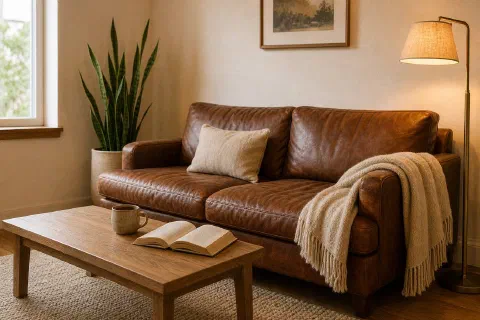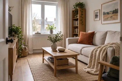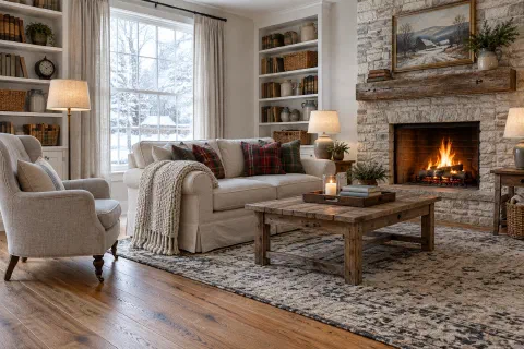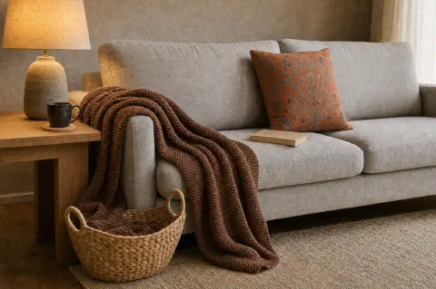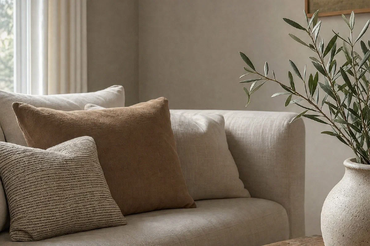
Some peaceful paint colors look beautiful online and icy in a real room.
That usually happens when the color is too clean, too blue, or too gray for the light you have. A calm room still needs warmth. It needs a color that can handle shade, lamps, wood tones, floors, and the things you already own.
These are the paint color families to test first if you want peaceful without cold.
Which Colors Suit Which Room
| Color | The room it suits | What it needs beside it |
|---|---|---|
| Soft Warm White | Any room that should feel clean but not sterile | Wood floors, linen, brass, warm leather |
| Oatmeal Beige | Living rooms, bedrooms, hallways, small rooms | Anything that needs more softness than plain white gives |
| Mushroom Taupe | Rooms that should feel grounded but not dark | A floor that does not pull the shade purple |
| Soft Gray-Green | Rooms with plenty of wood, cream, or brass | A muted version, since a minty one turns cool on the wall |
| Dusty Sage | Bedrooms, reading corners, mudrooms, bathrooms | Warm white trim so it does not go flat |
| Warm Greige | Rooms that mix warm and cool furniture | A greige with more beige in it than gray |
| Muted Clay | Bedrooms, small dining rooms, powder rooms, a cozy office | A softened clay rather than a saturated one |
| Smoky Blue With a Little Green | Rooms with warm wood, cream textiles, soft lamps | A lighter version if the room gets very little light |
1. Soft Warm White
Warm white is the safest calm color when you want the room to feel clean but not sterile. Look for a white with a small cream or beige undertone.
It works especially well with wood floors, woven shades, brass lamps, linen bedding, and warm leather.
2. Oatmeal Beige
Oatmeal is softer than tan and less yellow than cream. It gives the room warmth without making the walls feel heavy.
Try it in living rooms, bedrooms, hallways, and small rooms that need more softness than plain white gives.
3. Mushroom Taupe
Mushroom taupe is a quiet mix of beige, gray, and brown. It is useful when you want the room to feel grounded but not dark.
The trick is choosing a shade that does not lean purple. Test it beside the floor before you commit.
4. Soft Gray-Green
Gray-green can feel peaceful because it reads like nature without becoming bright or beachy.
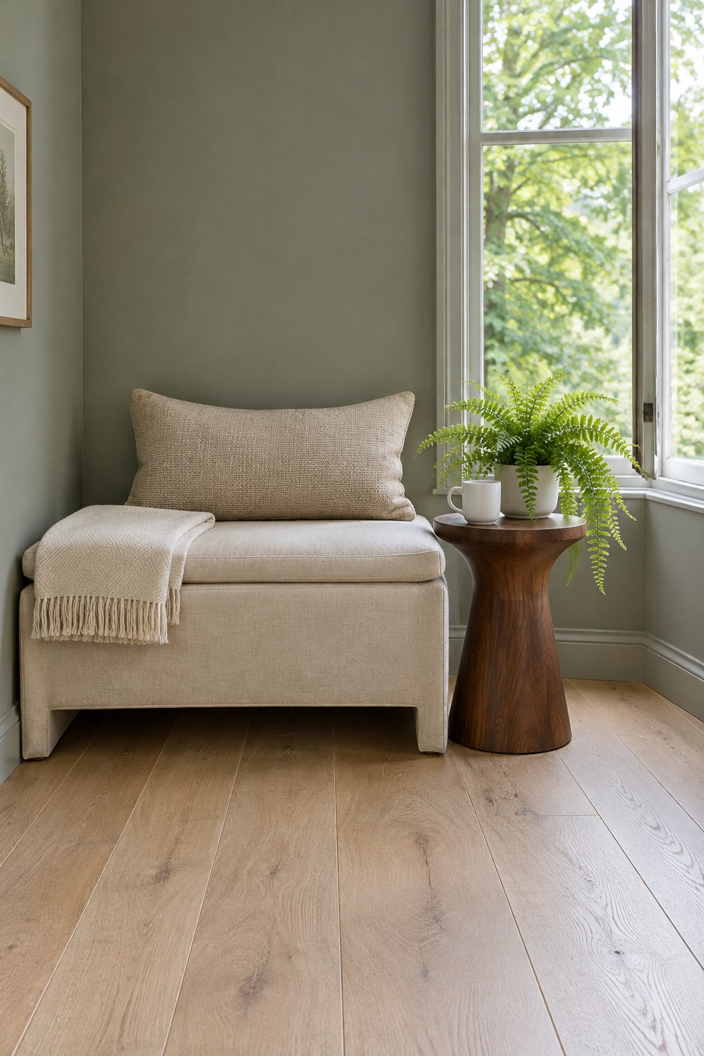
Choose a muted version with enough warmth to sit near wood, cream, and brass. If it looks minty on the sample, it may feel too cool on the wall.
5. Dusty Sage
Sage is one of the easiest colors to live with because it feels calm in morning light and cozy at night.
It works well in bedrooms, reading corners, mudrooms, and bathrooms. Pair it with warm white trim so it does not turn flat.
6. Warm Greige
Greige can go wrong fast, but the right one is useful. Look for a greige that has more beige than gray.
This is a good choice when your furniture mixes warm and cool pieces and you need the walls to settle everything down.
7. Muted Clay
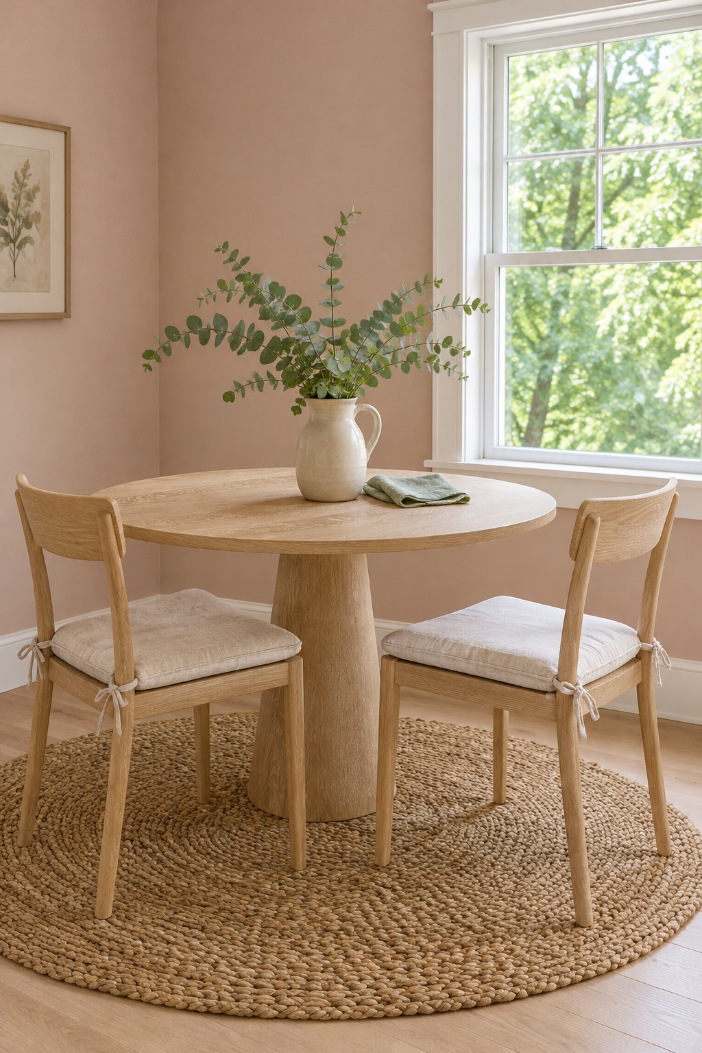
Clay sounds bold, but a softened clay or pink-beige can make a room feel warm, human, and quiet.
Use it where you want a little glow: bedrooms, small dining rooms, powder rooms, or a cozy office.
8. Smoky Blue With a Little Green
Blue can be peaceful, but clear blue often feels chilly. A smoky blue-green is easier to live with because it has more depth.
Try it in rooms with warm wood, cream textiles, and soft lamps. If the room gets very little light, test a lighter version first.
Why the same color looks warm in one room and cold in another
In interior design, the quiet color sitting under the main one is called the undertone. Two beiges can look alike on a card while one leans pink and the other leans green, and that hidden hue is what makes a wall feel cozy or chilly. Calm colors tend to be softened with a little gray and kept low in saturation, which is why every family on this list is a muted version rather than a bright one.
The window changes it next:
- North-facing rooms get cooler, dimmer light that pulls out blue and gray. Warm whites, oatmeal, mushroom taupe and warm greige hold up best.
- South-facing rooms get warm light most of the day, so the gray-green, sage and smoky blue-green families stay balanced instead of turning yellow.
- East-facing rooms are warm and bright in the morning and flatter by afternoon. A balanced greige or a softened green handles both.
- West-facing rooms glow warm in the late afternoon, which can push a cream or beige toward yellow. A muted sage or blue-green settles it.
Then the bulbs finish the job. Benjamin Moore notes that bulbs above 3,500 K tend to look cooler, which is the quickest way to turn a calm color clinical at night.
Test the Color Beside the Floor First
The floor tells the truth. A paint color that looks calm on a white card can look wrong beside orange wood, gray tile, or beige carpet. Check it beside the kitchen cabinetry and the sofa too, since those stay when the walls change.
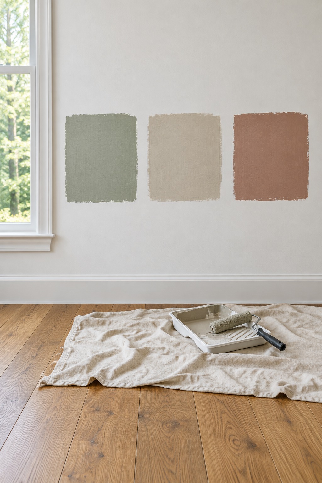
Paint a sample board and move it around the room for a full day. Check it in morning light, afternoon shade, and lamp light. The peaceful choice is the one that still feels good at night, when the atmosphere of the room comes from the lamps.
Ways to test a color: pick what fits you
These go from the least work to the most. Most people use two: samples to narrow the list, then a board for the finalists.
Some links below are Amazon affiliate links. If you buy through them, Etheric Echoes earns a small commission at no extra cost to you.
- Peel-and-stick sample sheets. Best for renters, or for trying five or six colors before you narrow down. They are made with real paint, and you can move them from wall to wall. Samplize, for example, sells standard 9 by 15 inch sheets in Behr, Benjamin Moore, Sherwin-Williams and Farrow & Ball colors on its own site. The downside is that the cost adds up one color at a time, and a sheet is smaller than a board. $
- Foam boards and a sample pot. Best for the final two or three colors. Roll two coats of the sample paint onto a 20 by 30 inch board and move it from wall to wall. The downside is time: you buy the sample pots separately and wait for each coat to dry, and this pack has 12 boards, more than one room needs. $$ See the foam boards on AmazonAs an Amazon Associate, we earn from qualifying purchases. Full disclosure.
- A 4 inch mini roller kit. Best if you want an even, solid sample, since a thin or streaky patch is hard to judge. It comes with foam covers, a frame, a tray and a liner. The downside is one more thing to wash, though the spare covers are handy for touch-ups later. $ See the mini roller kit on AmazonAs an Amazon Associate, we earn from qualifying purchases. Full disclosure.
- High color-accuracy 2700 K bulbs. Best for judging how a color looks under the lamps at night. This 4-pack is soft white 2700 K with a color rendering index of 90 or more, so colors look closer to true. The downside is the price per bulb compared with a value pack. $ See the 2700 K bulbs on AmazonAs an Amazon Associate, we earn from qualifying purchases. Full disclosure.
- A value pack of 2700 K bulbs. Best for changing every bulb in the room at once, so no lamp is cooler than the rest. This box holds 24 soft white 2700 K bulbs. The downside is that the listing gives no color rendering number, so use it for matching, not for judging the sample. $ See the 24-pack of bulbs on AmazonAs an Amazon Associate, we earn from qualifying purchases. Full disclosure.
The light you judge it under has numbers attached. The DOE Federal Energy Management Program lists 2,700 K as the warm, personal band it ties to homes and 4,100 K as the cool, efficient band it ties to offices and showrooms, and it notes that a change between the two is noticeable. That number is printed on the box: DOE’s Energy Saver guide says the light-appearance scale on a bulb label runs on a Kelvin temperature scale, with warm or soft light marked 2,700 to 3,000 K and blue-white light that mimics daylight marked 5,000 to 6,500 K. Buy the bulbs before you commit to the paint, so the sample board is judged under the light the room will actually have.
Before You Commit to a Color
- Buy the bulbs you plan to live with first, so the sample is judged under the room’s real light.
- Paint a sample board rather than a patch of wall, so you can move it instead of living with it.
- Test the board beside the floor, not against a white card.
- Move it around the room across a full day, then look at it again under the lamps at night.
- Only then buy the paint.
What to buy
Prices change, so check before you order. Cost: $ is the least, $$$ the most.
- Boards for sample paint: 20 by 30 inch foam boards, 12-pack (opens Amazon in a new tab)As an Amazon Associate, we earn from qualifying purchases. Full disclosure., $$
- A small roller for the boards: 4 inch mini foam roller kit with tray (opens Amazon in a new tab)As an Amazon Associate, we earn from qualifying purchases. Full disclosure., $
- Bulbs to judge the color at night: 2700 K soft white bulbs with a 90+ color rendering index, 4-pack (opens Amazon in a new tab)As an Amazon Associate, we earn from qualifying purchases. Full disclosure., $
- Bulbs for the whole room: 2700 K soft white bulbs, 24-pack (opens Amazon in a new tab)As an Amazon Associate, we earn from qualifying purchases. Full disclosure., $
What to Read Next
- Warm living room color palettes in six combinations takes one room and shows how these colors pair with each other rather than on their own.
- 12 small changes for a hygge home is the routine half of a calm room, for the part paint cannot fix.
- 10 things to declutter this week if your home feels too full is worth doing before you paint, since a busy room can read as a cold one.