A gallery wall with eight identical frames in a perfect grid looks like something you would see outside a hotel elevator, not something that lives in someone’s actual house.
I bought one of those matching frame sets years ago, eight black frames in three sizes, all from the same store display. It looked sharp for about a week, then it started reading as generic every time I walked past it, because nothing about it looked chosen. It looked assembled. The gallery walls that actually feel personal follow a looser set of rules, and most of them have nothing to do with symmetry.
Start with the one piece you actually love
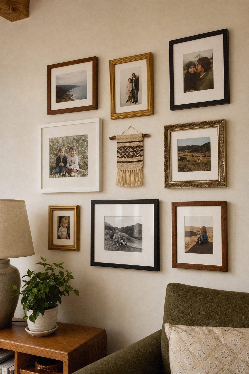
Pick the photo, print, or object you would keep even if you took everything else down. That piece becomes the anchor, usually placed at eye level, roughly 57 to 60 inches from the floor to its center. Everything else gets arranged around it, not the other way around.
Starting with a random assortment and hoping it comes together rarely works. Starting with one piece you are certain about gives the rest of the wall a reason to exist.
If the wall takes direct afternoon sun, that is worth knowing before you commit the good piece to it. The Library of Congress’s care guidance for works on paper asks for minimal exposure to all kinds of light and none of it direct or intense. A wall that faces a window all afternoon is the spot to keep for a print you would not mind replacing.
Leave 2 to 3 inches between frames
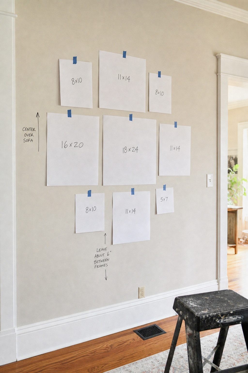
Frames crowded edge to edge read as cluttered, and frames spaced more than 4 inches apart start to look like separate, unrelated pieces instead of one collection. Two to three inches of breathing room between each frame is enough to let each piece read on its own while still feeling like part of a group.
Before hammering anything, cut paper templates the exact size of each frame, tape them to the wall in your layout, and live with it for a day. It is much easier to move painter’s tape than to fill a wrong nail hole.
Mix frame finishes instead of matching them
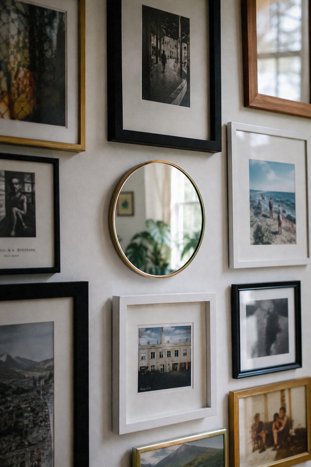
A wall with black, wood, and one brass frame reads more collected than one where every frame is the identical black from the same multipack. The mismatch is what signals that the pieces were gathered over time rather than bought as a set on the same afternoon.
If you already own a matching set, an easy fix is spray painting one or two frames a different finish, or swapping just two of them for secondhand frames in a different material.
Include one piece that is not a photo
A small mirror, a pressed botanical print, a woven textile, or a simple line drawing breaks up a wall of photos in a way that keeps the eye moving instead of scanning the same rectangle shape over and over. One non-photo piece is usually enough. Three or four starts to compete with the photos themselves.
Leave room for photos you have not taken yet
A gallery wall that fills every available inch on day one has nowhere to go. Leaving one small gap, or planning the layout so a photo from next year’s trip has an obvious spot waiting, keeps the wall from feeling finished and closed off.
If the wall already feels complete and you do not want to add anything, that is fine too. Just know it is not a requirement to fill every inch the first weekend.
Which Layout Fits Your Wall
Most gallery walls go wrong because the layout was copied from a photo of a different wall. Match the shape to the space you actually have.
| Layout | Best for | Watch for |
|---|---|---|
| Loose grid | A rectangular wall and a set number of frames you already own | Looks stiff the moment every gap is identical |
| One anchor with satellites | One piece that is clearly bigger and better than the rest | The anchor has to be good enough to carry the whole wall |
| Single row at eye level | A hallway, a sofa back, or a narrow strip of wall | Reads thin on a tall wall |
| Organic cluster | Walls you plan to add to over a few years | Needs a rough outline so it does not drift sideways |
| Salon style, edge to edge | High ceilings and a collection worth showing | Costs the most to frame, and is the hardest to change later |
If the wall is a hallway people walk through, keep the frames shallow. The ADA standards cap how far a wall-mounted object may stick into a walking path at 4 inches for anything hanging between 27 and 80 inches off the floor, which is worth borrowing at home, because a hallway there is just as narrow. A row of deep shadow boxes is the version that gets knocked sideways every time someone carries a laundry basket past it.
The four-rule starting point
- Anchor: one piece you love, hung at eye level first
- Spacing: 2 to 3 inches between frames
- Finish: at least two different frame materials or colors
- Mix: one non-photo piece among the photos
Four real choices, not eight matching frames, is what makes a gallery wall read as yours instead of a display in a store.
What to Read Next
- Styling a thrifted dresser without clutter for the same instinct applied to furniture instead of walls.
- Warm color palettes for a cozy living room if you are picking frame finishes and wall color at the same time.
- Cozy up a living room without a new sofa when the wall is one part of a room that still feels unfinished.
- Cozy apartment ideas for a rental that feels like home for hanging a wall you are not allowed to put big holes in.